
3 things to consider when choosing your Wedding colours
Pantones of 2017
At the start of every year, the Colour Gods get their heads together to decide which tints, tones & shades should be on the list of
I’m going to select 3 of the top
1. Greenery
This is a vibrant, almost luminous shade of Green, as the name suggests!
Although not the top of my list, it seems to have struck a chord with many of the big names in the wedding industry.
You hear all about ‘The year of Kale’ in Bridal magazines, & if Green is your
Anything goes. From the palest hint of Mint to the darkest Forest Green, go with what you love.
Teamed with neutral flowers, Rose Gold or Copper accents & tonnes of foliage for


2. Fuchsia Rose
As the name suggests, this is an intense shade of Pink!
Bright & bold, & possibly best suited for a Summer wedding, it’s sure to add a dash of sunshine to your venue.
This
But, if you’re a little worried about it being just a little too Pink, how about keeping your maids in the Pink, a pop of the same in your flowers &

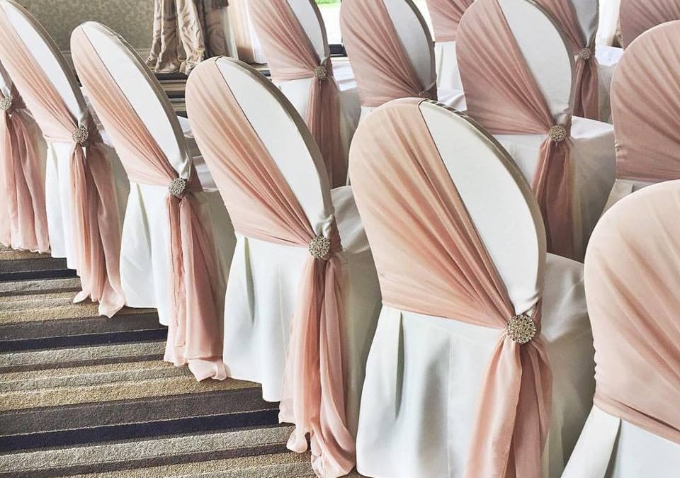
3. Sand Dollar
I adore this neutral palette! It’s elegant, timeless & compliments most skin tones.
Feminine & romantic, & considered not too Pink by most Grooms, shades of this Nude tone adds a small enough amount of
Teamed with Lace, it hits the ‘Vintage’ look to perfection. Or add in some bling for a Hollywood Glamour style, using diamante & crystal decorations for an opulent theme.

Opinion of a Venue Stylist
Whatever your choice of colours, one thing to think about is the decoration & colours used at your chosen venue. Play to its strengths, disguise its weaknesses. Any good Venue Stylist will help you select the right things to draw the eyes of your guests away from things that might not gel with your style.
If your venue is contemporary in style, it’s possible to use any colour, as the neutral tones of the venue will push your colour forwards.
However, if the venue is more traditional, opt for colours to brighten the space & then add your shade in strategically!
The old adage ‘less is more’ is often spot on.
There’s a little known tool you can use when picking your colour palette.
The Colour Wheel can be used to find what will work the best with your primary colour. You don’t want them to clash!
Colours adjacent to each other on the wheel are classed as complimentary colours, so will suit the main colour you’ve selected.
However, if you want your colours to pop, look at the colour directly opposite your shade on the wheel, as these are contrasting colours, which also work perfectly as a team.
Fabulous flowers by The Greenery. Click on the image for more information.


At Iced & Spliced by Cakey Wakey, we’ve helped lots of couples with their
One final piece of advice
My last piece of advice would be to leave your
It’s all part of the fun of planning the biggest day of your life, so have fun, go with what you like, & if that one Bridesmaid does throw a spanner in the works, sack her! How important was she anyway?
If you have any questions, please feel free to contact me. Just pop a message in the box below & we can have a chat about how to implement your


DROP US A MESSAGE

GET THE NEWSLETTER
