How do you pick your perfect Wedding colour scheme?
When it comes to picking the colour palette for your wedding, where do you start? Do you base things on your favourite shade? Could your future spouse insist that the colour of their football team is included in the wedding? Or do you pick a colour to complement the season your wedding is set in, to allow flower selections to fit nicely into the scheme too?
The honest answer is YES… to all of the above.
It’s your wedding, so you get to pick whatever you want.
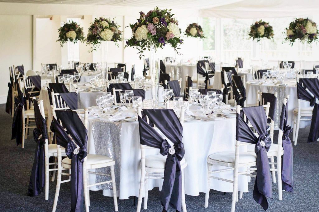
Plum, Ivory & Lilac Colour Scheme at Shottle Hall
In saying that, there are some things to consider to ensure that you have a colour scheme that works well and in this blog post I am going to share with you some things to consider when choosing the colour palette that will run through your day.
1. Look at the decoration & colours within your chosen Venue.
Your venue will likely have a certain aesthetic, whether that be modern and contemporary, traditional, quirky, or plain and simple. It is important to consider the canvas in which you are placing your colours.
Will the wallpaper and soft furnishings that are already in place clash with the colours you are considering?
Will the carpet clash with the tones of colour you have been thinking about?
If the venue has a certain style already in place, I would often suggest looking at neutral colours for your chair dressings and centerpieces to ensure that the design elements you have chosen are not lost in the noise of the room.
Work with the space you have by dressing stationary items, like tables and chairs, in muted colours, while the more mobile parts of a wedding… also known as Bridesmaids… can wear the colour you love.
When I first start working with a couple we get straight down to where they are having their wedding so that I can suggest colour palettes that will work well with both the venue and the uniqueness of the couple. There are clever ways you can bring colour or elements in your day without it taking over the entire theme.
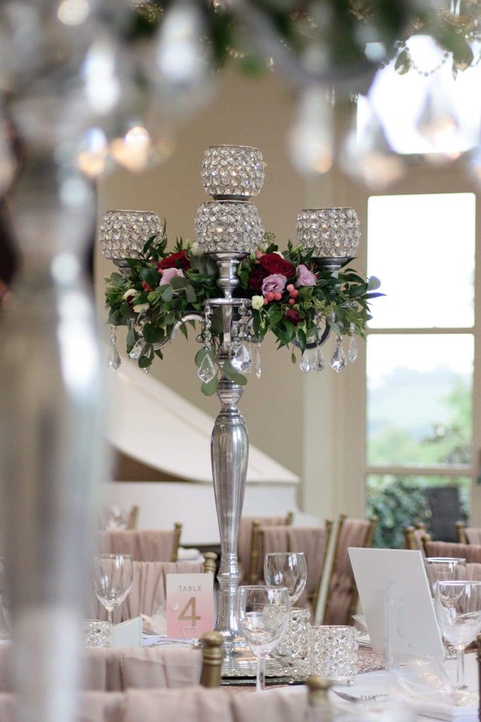
Blush Pink & sparkle at The Nottinghamshire
2. Colours can be arranged into ‘warm’ & ‘cool’ tones.
This is something I like to go into detail about during a consultation meeting.
Putting colours into the same tonal group helps to make sure that all colours really do complement each other. If you’re really stuck with what to use as an accent colour for your day, have a look at a ‘colour wheel’ (just google it and you will see one!)
This is a great tool for checking that the colours you’re drawn to sit well together. I bet you didn’t think it was so involved, choosing that perfect colour palette – it is one of my favourite things to do!
So, how does a colour wheel work?
Colours that sit side by side are ‘complementary’ to each other, meaning that shades of those colours blend well, giving a pleasing effect to the overall look of the colour together – they just work well together.
Colours that are opposite each other are known as ‘contrasting’ colours. They still work well together, but neither is a dominant shade.
Think about the way you decorate your home. Choosing colours for the walls and the furnishing so they just “work” well together, they flow, they complement each other. This is what we are doing with your wedding scheme.
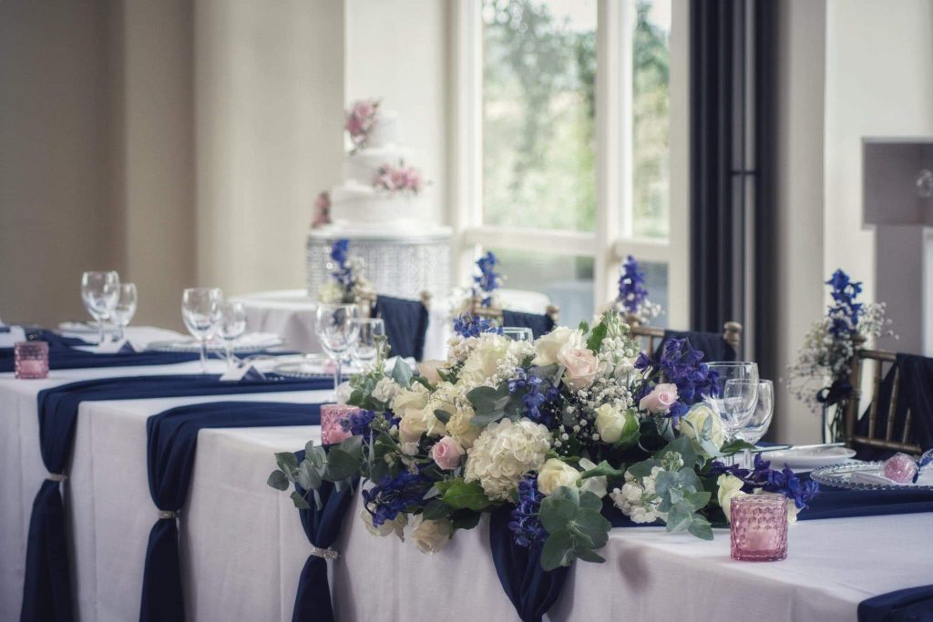
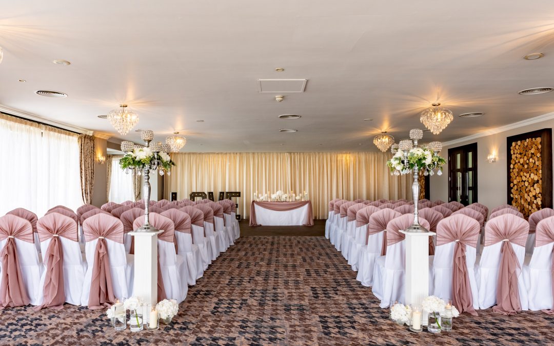
Navy & Blush Pink at Shottle Hall
3. If you have a specific theme in mind for your wedding, your colour palette will probably be led by any colours that are linked to that style.
For example, Rustic weddings tend to have a neutral undertone, using burlap, twine & natural shades. This tends to be the colour palette that naturally unfolds when you have a wedding of this style. You can also incorporate colour into this theme through by using coloured hessian which gives an instant pop of colour. Rustic doesn’t have to be all twigs and berries if you don’t want it to – you can blend the style with other complementary styles. I’ve loved adding some glamour to our woodland inspired wedding designs by introducing subtle bling to the centrepieces and details.
It may be that you want to theme your wedding around your favourite film or TV series and you can have lots of fun doing that. Again, it is important to look at the space you are dressing to make sure that the styles match together and you can either go all in and theme in a big way or you can include little nods to references of a film, TV series or football team for example by adding in some subtle elements without it taking over the entire colour palette and style.
We can look at ways to include your favourite things in interesting ways to represent you as a couple, while giving your guests something interesting to read or wonder about – a great conversation starter!
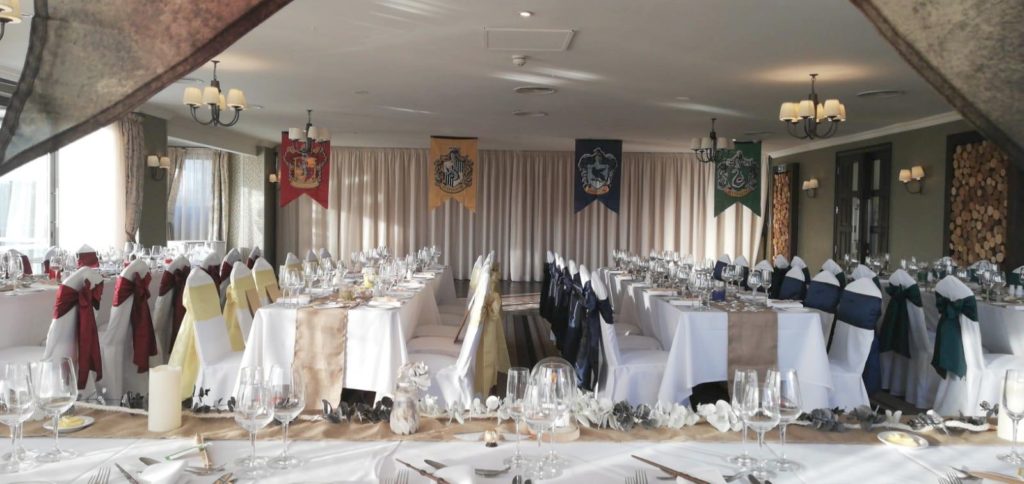
Harry Potter themed colours at The Nottinghamshire
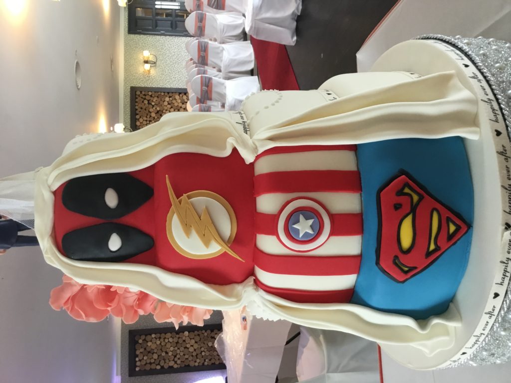
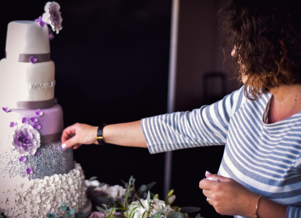
Marcel DC Inspired Reveal Cake
Tips from a Venue Stylist
I’d always recommend adding a splash of your chosen colour to your tables for the Wedding Breakfast, this really helps to tie the day together. This could be the same as your bridesmaid dresses or a complementary colour (remember the science of the colour wheel!)
It also helps deal with a vast expanse of white table linen which can overwhelm some centerpieces, or makes the table look lacklustre. You want a polished finish for every part of your wedding day.
Unless your colour scheme is white, adding runners to you tables, which match your chair dressings, breaks up the plainness of a table, drawing the eye towards the centre and all of the prettiness on display there.
Using accent colours on your table stationery and favours adds detail, but in a subtle way.
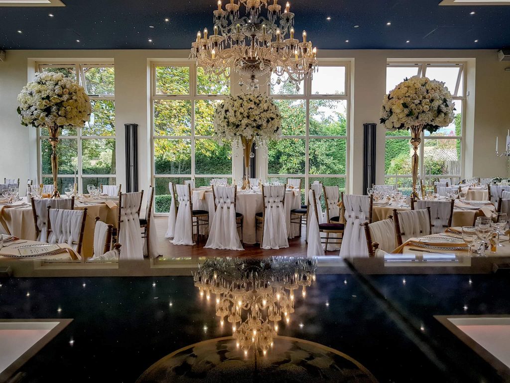
All White elegance at Shottle Hall
Personally, I’m drawn to certain colours, which you may see in my branding.
There tends to be a trend in the colour palette on my social media feeds too, but that’s all down to what our couples decide to choose.
I’ll admit that I do do a little happy dance every time a Bride mentions the immortal words ‘Blush Pink.
Throw in ‘with a Navy accent’ and I’m in colour heaven.
The term ‘pale and interesting’ really resonates with me.
I immediately imagine elegant drapes, muted tones and lots of florals and twinkly candlelight.
I recently invested in some gorgeous books about the anatomy of colour and how they blend and work together. It’s amazing to learn about the origins of colours, how they were developed and the history behind them.
I’m enjoying learning new ideas on how to mix palettes, with more meaning.
This knowledge helps me to help you in finding the right ways to include your favourite shades into your dream wedding day, making everything a true reflection of the two of you.
If you would like to chat about how to put your colours together, along with other little bits of advice, please let do get in touch and we can arrange a consultation www.icedandspliced.com/contact
Happy colour planning!
Jo
x